Brand Design & Product Design
Simpo
Making unfamiliar foods feel familiar. A digital product designed to help shoppers discover, understand, and connect with Asian cuisine.
Brand Design & Product Design
Making unfamiliar foods feel familiar. A digital product designed to help shoppers discover, understand, and connect with Asian cuisine.
Overview
Simpo transforms the grocery experience by combining product discovery, cultural education, and visual storytelling — helping people feel confident exploring new ingredients and cuisines.
Walking into an Asian grocery store can be overwhelming. With hundreds of unfamiliar products and packaging, many shoppers don't know where to begin. Simpo was created to bridge that gap.
Role
Brand Design
Product Design
UX Strategy
Tools
Figma
Illustrator
Photoshop
Deliverables
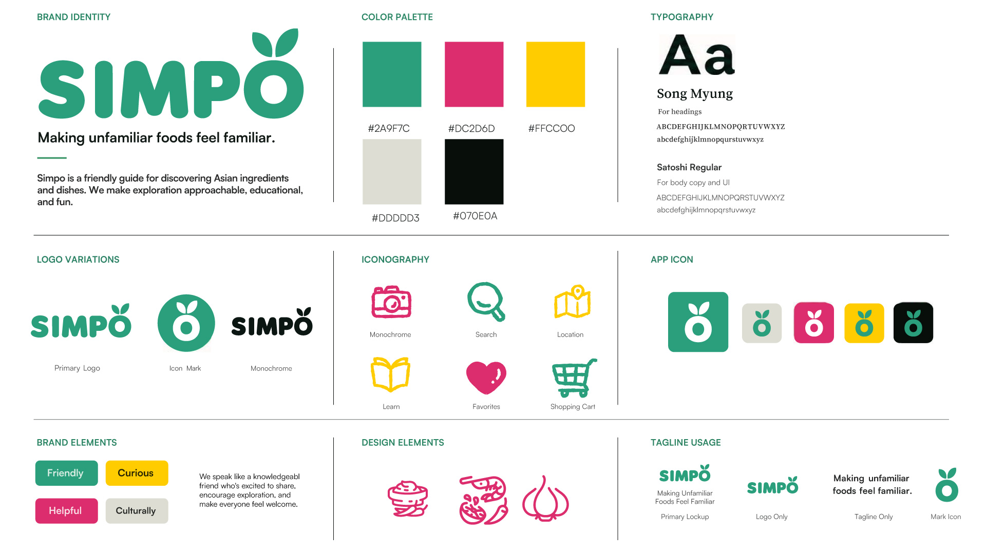
Brand Identity
App Design
Supporting Assets
Timeline
4 Weeks
Why Simpo?
Walking into an Asian grocery store can be overwhelming. With hundreds of unfamiliar products, names, and ingredients, many shoppers don't know where to begin. Simpo was created to bridge that gap.
Unfamiliar Products
Hard to identify ingredients and understand what they are.
Lack of Context
Shoppers don't always know how or when to use them.
Low Confidence
Many people stick to the same foods and miss out on new experiences.
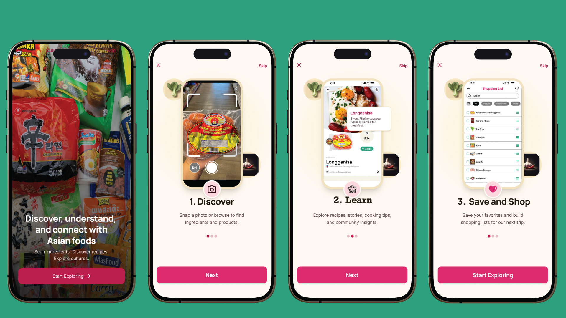
The Concept
Simpo guides shoppers through three intuitive steps — making the journey from unfamiliar to confident feel natural, not forced.
Find new ingredients through recommendations, categories, and visual exploration.
Understand products through cultural context, translations, recipes, and community insights.
Save favorites, build shopping lists, and explore new meals with confidence.
Brand Identity
Creating a friendly guide for food discovery.
The Simpo identity was designed to feel approachable, playful, and welcoming. Bright colors, simple illustrations, and friendly iconography make exploring unfamiliar foods feel less overwhelming.
Visual Language
Designing a product that feels human.
Beyond the interface, Simpo needed a personality that could exist across the entire experience — onboarding illustrations, product cards, social content, app store visuals, and educational graphics.
The Experience
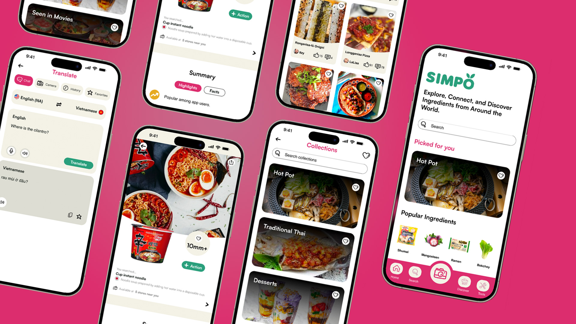
Six screens tell the full story — from arriving at the home feed to scanning an ingredient, learning its origin, finding a recipe, building a list, and locating it in-store.
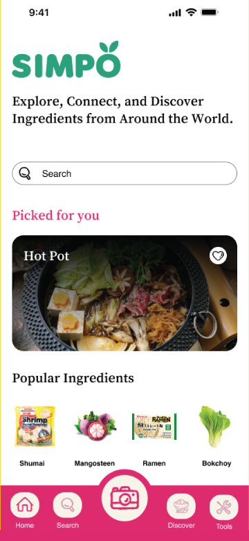
Discover
Explore ingredients, recipes, and trending items.
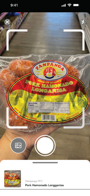
Scan
Scan barcodes to instantly identify products.
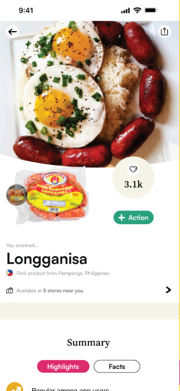
Learn
Dive into product details, origin, usage, and culture.
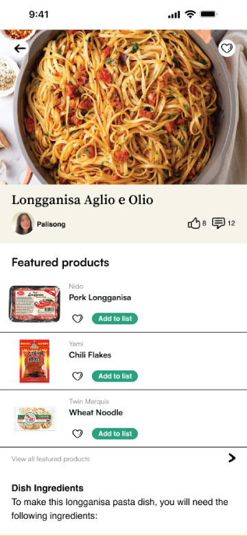
Recipes & Community
See how others enjoy it and get recipe ideas.
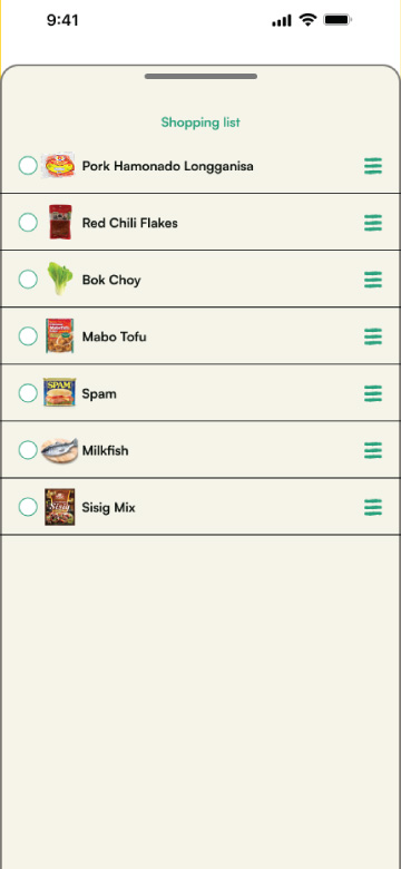
Shopping List
Save items and build your next grocery trip.
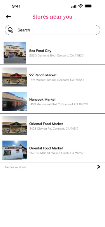
Stores Near You
Find nearby Asian grocery stores and markets.
Reflection
This project taught me that digital products are not only about creating usable interfaces — they are about creating trust, clarity, and meaningful connections.
Simpo combines my interest in branding, storytelling, and human-centered design into one experience.
Try It Out
Explore the full interactive prototype below — click through the Discover, Scan, Learn, and Shopping List flows yourself.