Brand Design & Campaign Design
Hydrogen Bus Campaign
A moving identity for the future of clean transportation.
Brand Design & Campaign Design
A moving identity for the future of clean transportation.
Overview
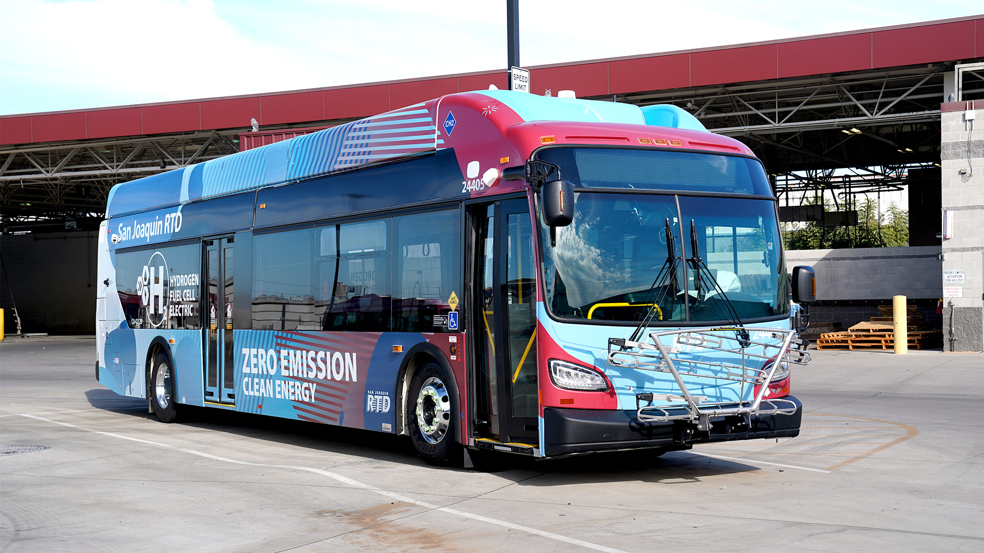
RTD introduced its first hydrogen fuel cell bus as a major step toward a cleaner future. I created a bold visual identity that transformed a transit vehicle into a moving symbol of innovation, sustainability, and community progress.
Role
Brand Design
Art Direction
Campaign Design
Tools
Illustrator
Photoshop
InDesign
Deliverables
Bus Wrap
Event Branding
Print & Digital
Timeline
2 Weeks
The Challenge
RTD needed more than a vehicle wrap. The hydrogen bus represented a major investment in cleaner transportation, so the design needed to communicate innovation while still feeling connected to the community it serves.
Because the bus would travel throughout Stockton and San Joaquin County, the design had to work from a distance and create impact while moving — readable at 40 mph, from a block away.
Design Inspiration & Concept
References ranged from hydrogen and clean-energy visual language to transit graphics built to be read at speed. Those references shaped three core principles behind the final design.
A Transition Toward the Future
The gradient moves from RTD's familiar brand colors into hydrogen-inspired blues and clean whites — representing the shift toward next-generation transportation.
Energy in Motion
Flowing shapes and layered patterns reflect hydrogen, technology, and the movement of transit — dynamic forms that echo the energy beneath the surface.
Built to Be Seen
Every decision — color weight, form scale, contrast — was made for the street, not the screen. The design creates impact while moving and works from a distance.

Brand Guide
Color, typography, and graphic elements were defined as a flexible system — built to extend cleanly from the bus wrap to every piece of marketing collateral that followed.

Packaging the Wrap
Beyond the visual design, I built out the complete dieline — mapping the artwork precisely across every panel, window cutout, and contour of the bus. This is the production-ready file that took the concept from a flat graphic to an installable wrap.

Swag & Materials
The wrap became the foundation for a full event identity — a trifold brochure, educational flyers, and printed materials that carried the same visual language into people's hands.

Trifold brochure — designed to translate the wrap's visual language into a printed, take-home format.

Brand in Action


Reflection
The launch introduced RTD's first hydrogen fuel cell bus and Stockton's first commercial hydrogen fueling station, bringing together community leaders, transportation advocates, and local officials.
The campaign received industry recognition from GDUSA and APTA, with strong community engagement and hundreds of thousands of digital impressions.